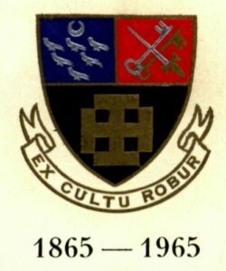
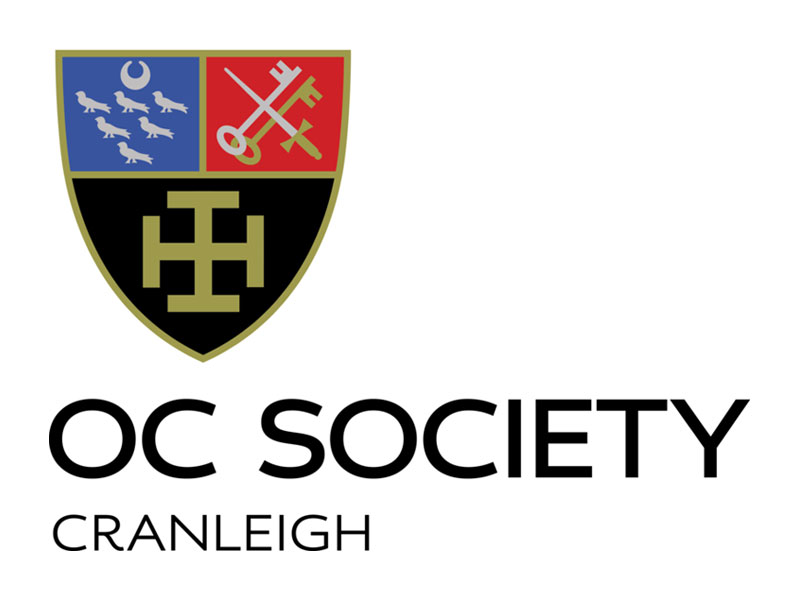
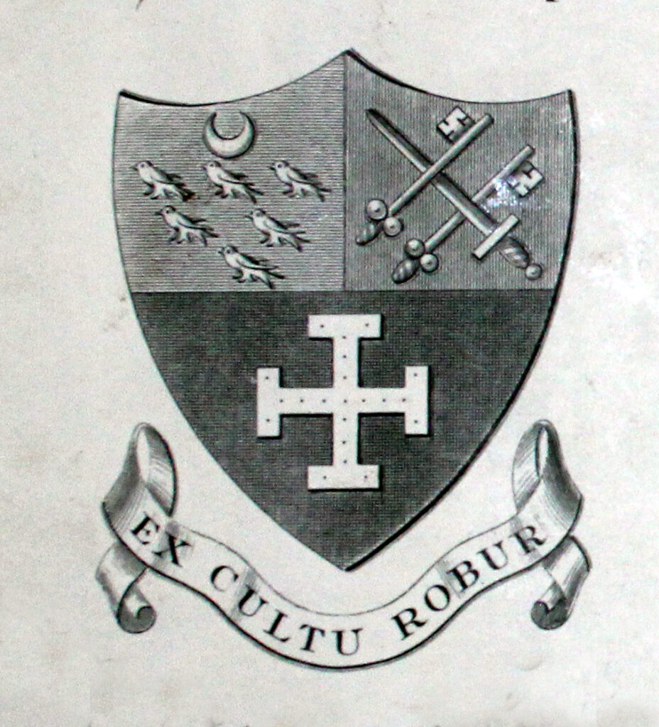
The School receives regular requests concerning the origins of the Cranleigh crest, what the various components on it mean, and how it has changed over the years. This article should help explain it all.
Cranleigh’s motto, Ex Cultu Robur, which has a variety of translations, the most used of which is “From culture comes strength”, was one of three options offered to Joseph Merriman, the first headmaster, by Edward Benson, at the time the headmaster of Wellington and one of Cranleigh’s founders in the months before the School’s opening in 1865. The rejected alternatives are unknown but The Cranleighan in 1925 listed the alternative translations as “knowledge is power”, “training makyth man”, and the decidedly clumsy “fear of the Lord is the beginning of virtue”.

Early histories of Cranleigh state that the shield was devised by Merriman and his first art master, something Elystan Phillips (MCR 1938–1970), an heraldic expert, said was far from uncommon in Victorian times. However, elements of the shield can be seen on some of the original buildings, which pre-date Merriman’s appointment. The dedication stone above the main entrance, for example, shows the martlets of Sussex “differenced” by the half moon above them. Although usually referred to as Cranleigh’s crest, this was inaccurate; it was not and is not a crest as such, but “an heraldic device”. Phillips said to refer to a crest was “like talking about bails when you mean stumps”.
The six martlets on the top left relate to the county of Sussex. Cranleigh was in an area administered as part of Sussex in those days, and Surrey did not obtain its own arms until 1934. Some boys were convinced the birds were cranes with the legs shot off. The half moon over the martlets is an heraldic device to show a second son, indicating the less than complete association with Sussex. The cross-keys and sword on the right derive from the arms of the Diocese of Winchester. The ecclesiastical connection is appropriate, with keys to knowledge and a sword for valour reflecting the school motto. The golden cross potent on a black background has been used in isolation since the earliest days; the only item of official clothing in Merriman’s time was a cap with the cross on it. Originally, the lines on the cross were thin but these, like many Old Cranleighans, became meatier with the passing of years. The cross potent is now the stand-alone emblem of the Prep School.
The shield has been through several versions in the 150 years, but most changes have been cosmetic, with subtle adjustments to the shape of the shield and the size of the contents. The one major overhaul happened in 1987, when Phillips alerted the governors to the fact the shield was not registered with the College of Arms and, as such, could not be copyrighted. As a result a design agency was employed, and they came up with the version in use to this day, which for a time was expanded to include “the traditional mantling, helm and crest” capped by a crane holding the flaming torch of knowledge. The half-moon disappeared at this time; as it was now officially registered as part of Cranleigh’s arms, the need for cadency was redundant.
The new design did not please everyone. Hugh Hawes (Cubitt 1968) wrote an indignant letter to Contact magazine describing it as looking like “a chocolate box, a bogus regimental blazer, an airline’s livery … in short, it looks cheap”.
The School now uses the instantly recognisable simplified shield, while the Old Cranleighans continue to use the original design.

